Page History
Anchor top top
| Info | ||
|---|---|---|
| ||
An Episode is a set of time-correlated geophysical, technological and other relevant geodata that relates comprehensively anthropogenic seismicity to its industrial cause. In other words, an Episode is a set of data related to a common industrial process, and that are intended to be analysed together in order to better understand this process, its environment and consequences. Clearly, the episode data may also be used separately to compare different processes and create tools for their analysis and prediction. By September 2021, 37 AH Episodes are integrated in the EPISODES Platform |
Navigating to AH Episodes
There are multiple ways to access the AH Episode data available in the IS-EPOS web platform. The User may click on the 'AH Episodes' tab from the portal main menu in the top left corner of the screen (Field 1, Figure 1). In such way, all the available episodes are displayed on the screen along with options for selecting and filtering data. This view is described in detail in the next section. Another option is using 'Advanced data search' (Field 2, Figure 1), which will be described in a separate section.
| Anchor | ||||
|---|---|---|---|---|
|
The projects associated with each episode along with the level of access are shown and the User can filter the episodes according to this criterion (Field 3, Figure 1). The User is also given the possibility for selecting among AH Episodes according to the technological/production process they are connected with. This can be done by ticking the small boxes shown in Field 4 of Figure 1. The User can now click on one of the Episodes (e.g. 1993, 2000, 2003 Soultz-sous-Forets Stimulations, Field 5, Figure 1) from this list to get access to the corresponding data.
| Anchor | ||||
|---|---|---|---|---|
|
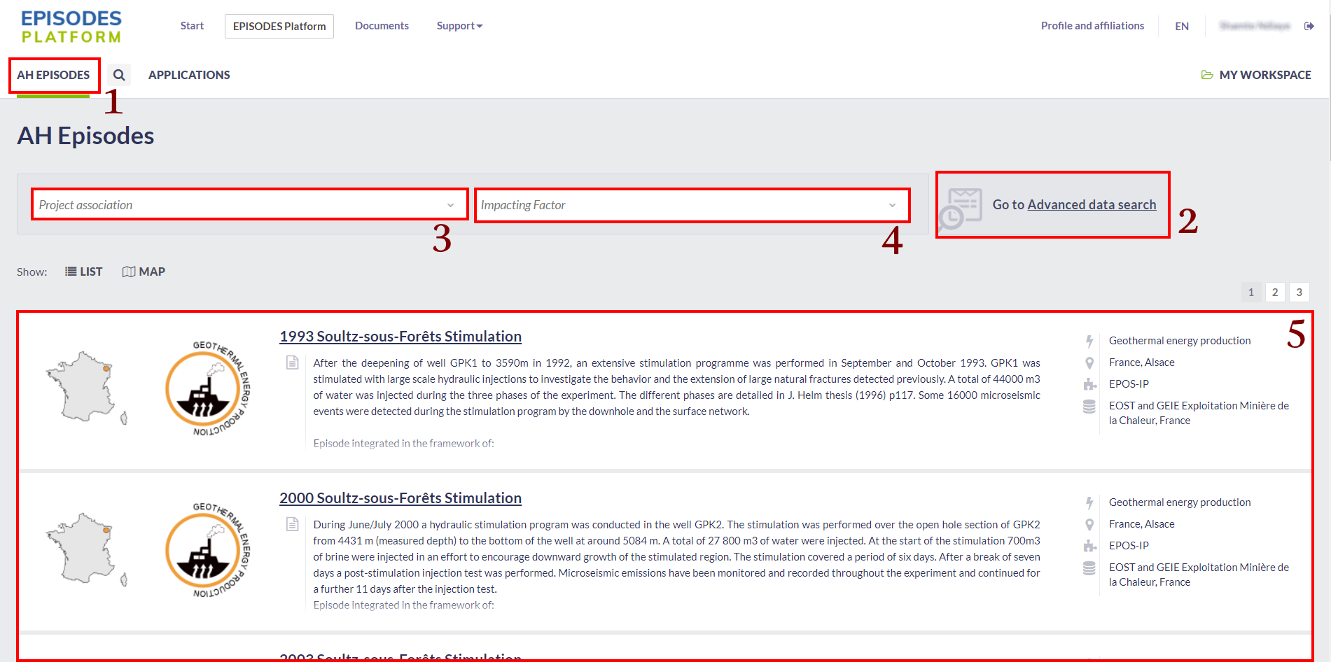
Figure 1. View to the main window in the EPISODES Platform.
For each one of the AH Episodes from the list, some short information concerning the location and the technology associated with the Episode is provided. In addition, a world map is shown at the bottom of the screen with the exact location of the selected episodes depicted on the map (Figure 2). Zooming, map/satellite view, drawing of national borders and full screen mode are options available for the map handling. Clicking on a pin will lead to the corresponding Episode page.
Anchor Fig2 Fig2
Figure 2. World map with the exact location of the selected episodes from IS-EPOS Platform, corresponding to geothermal energy production.
| Anchor | ||||
|---|---|---|---|---|
|
Figure 3 demonstrates an example of a page with data from Legnica-Głogów Copper District Episode. The structure and interface is identical in all cases of AH Episodes. Some informative fields are displayed in the right top corner of the screen such as the Episode State, Industrial process and Region (Field 1, Figure 3). A short Description of the Episode and the associated project is shown in Field 2, Figure 3. Some images related with the selected Episode are also displayed, providing additional information. Episode Data is found just below the Description and they are categorized into groups of different data types, i.e. Data relevant for the considered hazard like seismic or air quality, Industrial and Geodata (Field 3, Figure 3). Seismic Data includes mainly seismicity catalogs, seismic network information and waveforms corresponding to seismic events as they were recorded by the stations. Geodata includes mainly velocity models from the site of the Episode and maps with local faulting systems. On the other hand, Industrial data contains a group of data files which is directly connected with the technological-production processes that induce the anthropogenic seismicity (see the example from LGCD Episode, Figure 3). There are additional fields shown in Field 4, Figure 3: 'All data related to this episode', which leads to the Advanced data search with search parameters set to be the chosen data group within the present episode. 'Available visualizations' (Field 5, Figure 3) enables to the User to see visualizations prepared for the selected episode to show its main features - examples of such visualizations are shown in section Specific Episode Visualizations. Finally, clicking on Field 6 of Figure 3, 'See more information in Document Repository', leads the User to the Document Repository, to seek for references and further details concerning the Episode, data, methods etc. Resources and information on the data provider are appended in the web page.
Anchor Fig3 Fig3
Figure 3.View to the data episode window in the IS-EPOS web platform.
All of the aforementioned data sets can be selected by clicking and then be added to workspace (selecting 'Add to workspace' from the 'Actions' tab) to be used for the available applications.
| Anchor | ||||
|---|---|---|---|---|
|
For most of the episodes, the most representative data sets are presented together as a visualization - in form of a map view (e.g. Seismic Network, mining area, reservoir shoreline) or graph charts (e.g. velocity model, mining front advance, injection rate). The most important and common visualizations will be described in the next subsections.
Integrated Episode Data Visualization
The map view - like data can be combined and demonstrated in a single map by selecting the 'Integrated Episode data visualization' from the 'Available Visualizations' menu (Field 5, Figure 3). Seismic events (red circles), network of seismic stations (green triangles) and various episode-related data can be shown/hidden by setting/removing a tick in the small boxes shown in the top of Figure 4.1. The visualization is offered for every episode containing a Catalog, Seismic Network or other data that can be visualized on the map.
Anchor Fig4 Fig4

Figure 4.1. Example of combined "Intergrated Episode data vizualization" for Bobrek Mine episode.
Production data with Seismic Activity (For Particular AH Episodes)
In these visualizations the technological activity (either reservoir water level or wellhead pressure) is plotted in the same diagram with the histogram of the seismic activity. There are options for both parameters as shown in Figure 4.2 (top left corner). The step and time unit (hours, days or weeks) of the seismic activity can be selected for the histograms of seismicity (blue panel).
The zooming (in the X-axis) can be performed in two ways: First by selecting a predefined time unit, shown after 'Zoom' field (blue panel), among 1 month, 3 months, 6 months, YTD (i.e. from the beginning of the current year up to date), 1 year and all (i.e. the entire period). The second is to interactively zoom in/out the X-axis on the lower frame (shown in the red box in Figure 4.2). The User has just to click on the small rectangles at the left and right of the shaded panel and drag them to either direction in order to select the time period he/she wishes. The selected period can be shifted towards left/right by either dragging the cursor after clicking into the shaded part, or by using the small arrows at the left and right bottom corner of the lower frame (depicted by the red box in Figure 9). In any case the starting and ending date of the chosen period is noted in the screen (green box in Figure 9). Each one of the plotted parameters can be hidden or shown by clicking on the legend, found at the very bottom of Figure 4.2.
The visualization is available for episodes containing a Catalog and production data with timestamps - e.g. Water Level/Injection Rate/Wellhead pressure.
Anchor Fig4.2 Fig4.2

Figure 4.2.Water level/Wellhead pressure with seismic activity plot.
3-D Visualizations
This is a 3-D integrated visualization tool which provides an interactive spatial and temporal representation of the seismicity evolution in the AH Episodes and its connection with the production data (e.g. mining front advance, wellhead pressure etc) as demonstrated in Figure 4.3. The instructions for applying rotation and zoom in the Figure are shown in the top left corner of Figure 4.3. The seismicity can be shown as a video/animation by using the tools available in Field 1, Figure 4.3. From right to left, the symbols correspond to: Play video forward, jump to the next time point, pause video, jump to the previous time point, play video backwards. The progress of the video is indicated by the black dot moving along the grey bar, found just below the "Date" text, at the top of Figure 4.3. The objects manager (Field 2, Figure 4.3) can be used at any time in order to hide/show selected objects on the screen such as the injection wells, the seismic events, the stations of the seismic network, the surface map and the map scale, with respect to the selected episode. Field 3 in Figure 4.3 show a color scale to interpret the seismic events depicted in terms of their size (magnitude). Finally the User may change the velocity model view in the illustration from Vp to Vs and vice versa by clicking on the "Change velocity model to Vs" button, as shown in Field 4, Figure 4.3.
The visualization is available to episodes: Bobrek, Czorsztyn, Gross-Schoenebeck, LGCD, USCB and Song Tranh.
Anchor Fig4.3 Fig4.3

Figure 4.3. 3D seismicity visualization.
Integrated GIS data
This visualization allows User to integrate GIS data into an interactive base map plot (Figure 4.4). The User can introduce to the plot fault segments, operating edges in mining seems, seismic events ans network and front advance.
The visualization is available only for episode Bobrek. Anchor Fig4.4 Fig4.4
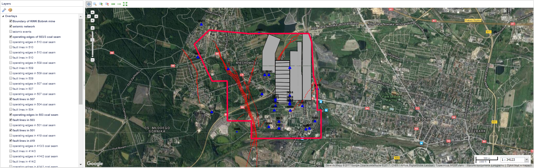
Figure 4.4. Integrated GIS data in an example for Bobrek mine.
| Anchor | ||||
|---|---|---|---|---|
|
Additional options are available for some specific kinds of data (e.g. Catalog), they will be described in datail in the next subsections.
Seismic Catalog (Catalog)
Seismic catalog contains various important information as demonstrated in Figure 5 and subsequent figures (Figure 5.1-5.8). The User may upload the catalog data in the workspace by selecting 'Actions' (blue tab, right top corner of Figure 5) and then 'Add to workspace' either as a link (following the updates in the dataset) or as a copy. In both cases the filed can be moved in a particular location (folder) in the User's workspace. Information on the file can also be displayed on the screen and the data can be downloaded in .mat format. A short summary of the catalog is provided, containing the number of events, time period that the Episode covers, depth range of seismicity and magnitude range of the events. Next to the summary, there are some action tabs (Field 1, Figure 5) including (with respect to the AH Episode) Show Catalog, Seismic Activity Plot, 3D Event Distribution, Events in Local Coordinates, Benioff Plot etc. The attributes of the catalog are displayed below 'Data' Section, and they comprise the Name of the attribute, a brief description, the minimum and maximum values and the number of valid values (i.e. values that exist, not NaNs). The 'PLOTS' tab gives the chance to perform 1-D plot, histrogram, cumulative histogram and reversed cumulative histogram. The tabs in Field 3, give the chance of performing various 1-D, 2-D and 3-D plots, 2-D histograms and seismic activity plots together with selected parameters. Some of the actions available to be chosen from menus displayed as Fields 1, 2 and 3, Figure 5 are described in the the following paragraphs. Anchor Fig5 Fig5
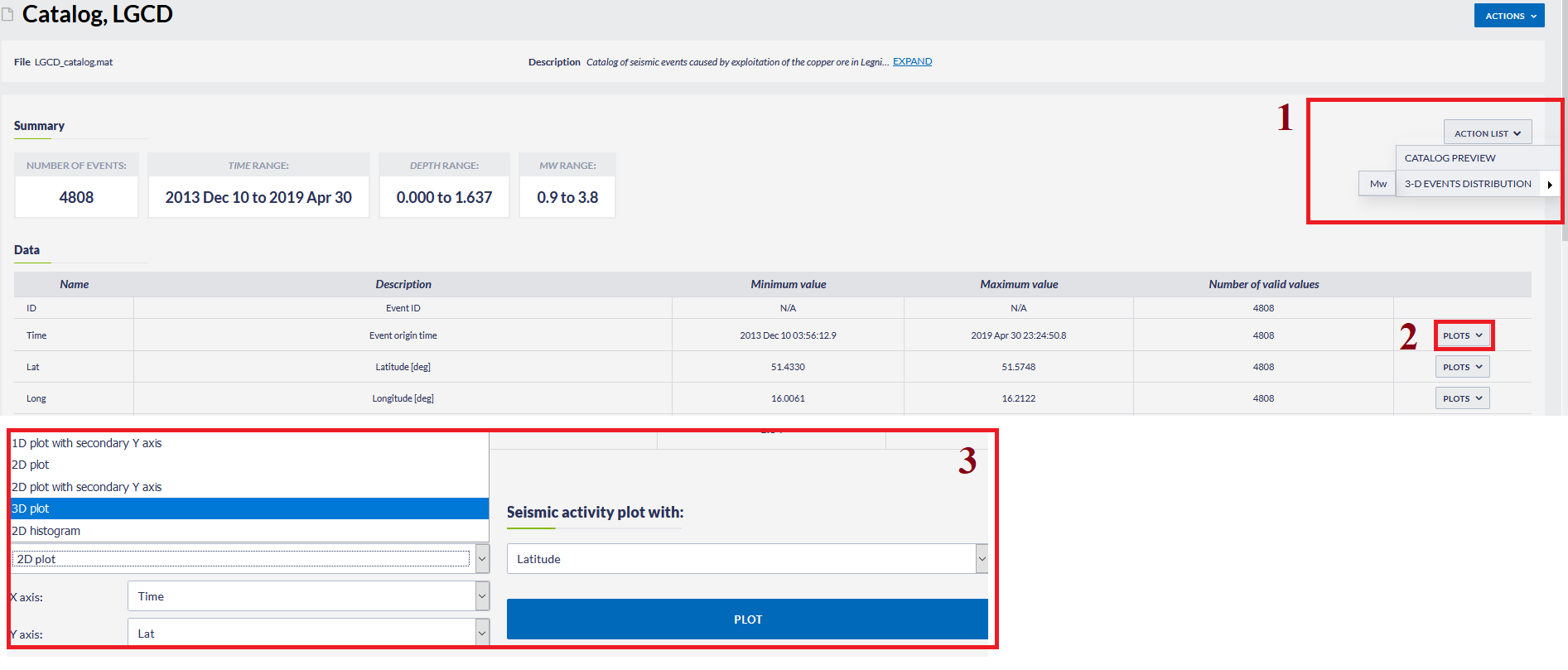
Figure 5. Example of seismic catalog and available handling options.
Catalog Preview (from Actions List, field 1, Figure 5) : Detailed information on the attributes of every event in the seismic catalog is demonstrated (Figure 5.1). These data appear as pop-up windows and are shown in pages, each one containing 20 rows. The User can proceed to the following or previous pages by clicking the left-right arrows shown in the bottom left part of Figure 5.1. The events can be sorted in ascending/descending raw according to any parameter, by clicking at one of the parameters headers. Searching and filtering of the catalog is also provided (red field, Figure 5.1).
Anchor Fig5.1 Fig5.1
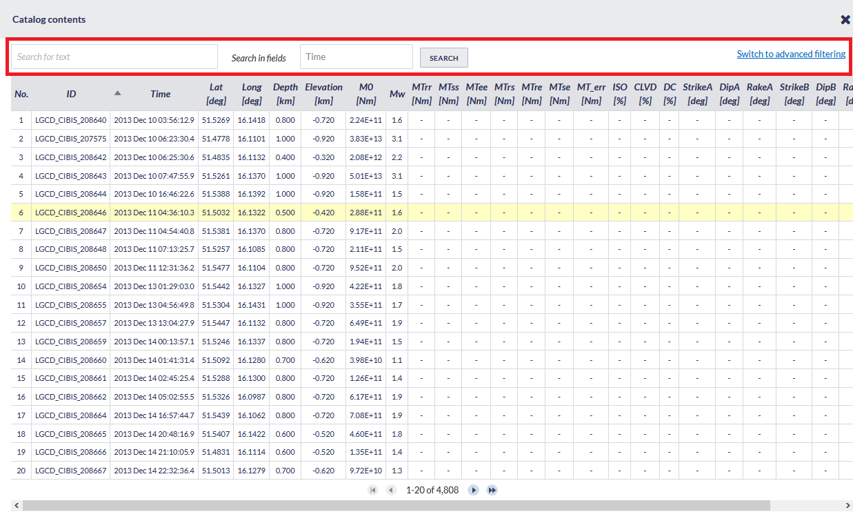
Figure 5.1. Catalog contents.
- Histogram (from Actions List, field 2, Figure 5 ) : This option shows the histogram of the selected parameter (Figure 5.2). Zooming in/out and linear/logarithmic scale of the y-axis and selection of step (bin width) are available.
Anchor Fig5.2 Fig5.2

Figure 5.2. Histogram of magnitudes.
- 3D events distribution (from Actions List, field 2, Figure 5 ) : 3D spatial distribution of the events foci (longitude,latitude,depth), as circles with size proportional to the event magnitude (Figure 5.3). Rotation of the plot is possible after clicking and dragging the cursor through the plot area. The focal coordinates of each event are depicted when the cursor is pointing on a circle.
Anchor Fig5.3 Fig5.3

Figure p3. Events location and magnitude 3D plot.
- Benioff plot (from Actions List, field 1, Figure 5 ): A Benioff plot (square root of energy against time) can be created for those catalogs which include information on seismic energy released by the seismic events (Figure 5.4). Zooming in/out and linear/logarithmic scale of the y-axis are available.
Anchor Fig5.4 Fig5.4

Figure 5.4. Benioff plot.
- Events in local coordinates (from Actions List, field 1, Figure 5 ):This option generates 2-D plot of the epicentral coordinates of the seismic events (Figure 5.5) in local (cartesian) coordinate system (when those are available). Zooming in/out option is available for this figure.
Anchor Fig5.5 Fig5.5

Figure 5.5. Events in local coordinates plot.
Additional plotting options are available by clicking on the gear icon shown in Field 2 of Figure 5 (right hand side). These options include histograms (interval, cumulative and reversed cumulative histograms) and 1-D plots. Zooming in/out and linear/logarithmic scale of the y-axis are available. Moreover, in histograms the bar step can be modified and in 1-D plots the chart type can be switched among column, scatter, spline and line.
Even more visualization options are available at the bottom of the screen, as shown in Figure 5.6. The epicenters of the seismic events are demonstrated on a google map, which are equipped with zooming, map/satellite view, drawing of national borders and full screen mode options. The events serial numbers, their origin time and the magnitudes, are shown on the screen after the User clicks on one of the events depicted by the red circles.
Anchor Fig5.6 Fig5.6

Figure 5.6. Additional plotting options
A variety of plots are available. The User can chose one of the following plot types, defining the attribute to be shown at the X, Y and Z axes:
- 1-D plot with secondary Y-axis (zooming in/out and linear/logarithmic scale of the x-axis and y-axis are available)
- 2-D plot (zooming in/out and linear/logarithmic scale of the x-axis and y-axis are available)
- 2-D plot with secondary Y-axis (zooming in/out and linear/logarithmic scale of the x-axis and y-axis are available)
- 3-D plot (rotation of the plot is possible after clicking and dragging the cursor through the plot area)
- 2-D Histogram, as shown in Figure 5.6.2 (rotation of the plot is possible after clicking and dragging the cursor through the plot area).
1-D and 2-D plots - including 1-D and 2-D plots with secondary Y-axis give the user an option of choosing between linear and logarithmic scales for X and Y axes (ticking on small boxes, Field 1, Figure 5.6.1) and selection of diverse graphic views among scatter plot, spline, column and line. Plotted parameters may be hidden and re-appear by clicking at the legend (Field 2, Figure 5.6.1). By holding the cursor still onto an option or in a figure element [e.g. bar in histograms or points in scatter plots], information on this option or element appears on the screen (Field 3, Figure 5.6.1). Many figures have enabled zooming options for focusing in a specified range among the values. This is achieved by clicking at a point of the figure and dragging the mouse cursor either leftwards or rightwards. Instructions are shown at the bottom of the figure as well (field 7, Figure 5.6.1). Zooming can be reset by clicking on the 'Resert Zoom' tab shown in Field 4 of Figure 5.6.1. The user may save a selected figure (Field 5, Figure 5.6.1) in one or more of the following formats by clicking on the square panel: .png, .jpeg images, .pdf document or .svg vector image. Alternatively, for some figures the user can download the corresponding data and save them in .csv format in order to use it for further analysis. The figures can also be printed (also from Field 5, Figure 5.6.1).
Anchor Fig5.6.1 Fig5.6.1

Figure 5.6.1. Options available for generic plotting/figures.
Anchor Fig5.6.2 Fig5.6.2

Figure 5.6.2 Depth vs local magnitude 2D histogram.
Finally, seismic activity can be plotted together with any other parameter as shown on the top right corner of Figure 5.6. An example of seismic activity plotted with latitude is shown in Figure 5.6.3. The time step can be set by the User. The time unit can be chosen as well among hour, day and week. These options are activated by clicking on the "OK" button. Zooming in/out and linear/logarithmic scale of the y-axis are available for this plot. The displayed chart is similar to the one displayed for the production data with seismic activity visualization (see Figure 4.2).
Anchor Fig5.6.3 Fig5.6.3

Figure 5.6.3. Seismic activity plot with Latitude.
Anchor AdvDataSearch AdvDataSearch
Advanced Data Search
| AdvDataSearch | |
| AdvDataSearch |
This option provides an advanced data search tool, by the means of multiple data filtering, that can be accessed in two ways (see Figure 1 - 'advanced data search' and Figure 3 - 'all data related to this episode'). The following filters are available for the User (Red panel of Figure 6). The User may select one or more options by ticking the corresponding small boxes (green panel, Figure 6).
Anchor Fig6 Fig6
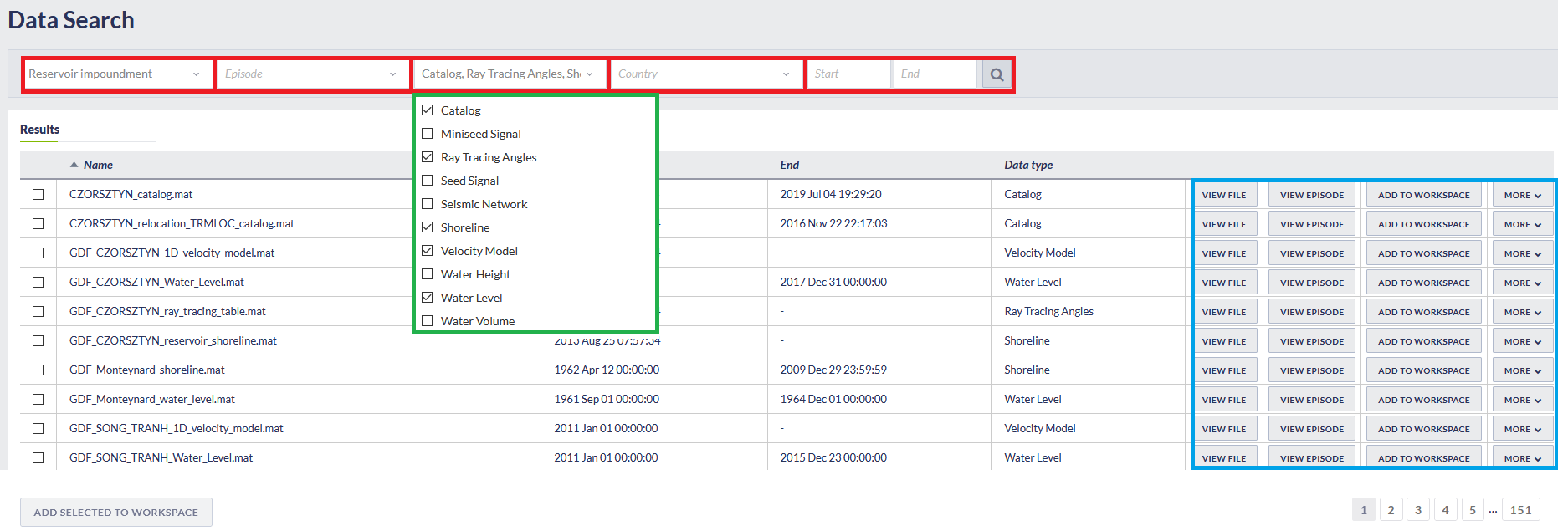
Figure 6. Data search interface.
The available filters are:
- Data Type
- Country
- Episode
- Impacting Factor
One additional filter is also provided, in which numerical data is addressed:
- Time Range: The User is requested to provide a temporal constraint for the data by entering "Start" and "End" time into the corresponding empty boxes.
After the selection of the appropriate filters, the User shall click the 'Search' button and the resulting datasets appear on the screen (Blue panel, Figure 6 ). In the case when too many datasets have been selected, the use of the page numbers (right bottom corner of Figure 6), provides access to the those data which are not shown in the screen. There are 4 actions the User may now attempt (blue panel of Figure 6 ):
- View file: This choice will provide data features and options just as in the conventional data search described earlier in this section.
- Vie Episode: This choice leads to the selected Episode main page.
- Add to workspace: This choice is a shortcut to add the data in the workspace (see 3, below)
- More: This choice will upload the corresponding dataset to the User's personal workspace for further processing (either as a link or copy). Alternatively the User may put a tick on one or more of the small boxes at the left side of the figure and then click on the "Add to workspace" bar, located below the table (found in Figure 6 ). Moreover by clicking on this icon the user may download the data or show file information on the screen (Figure 6.1).
Anchor Fig6.1 Fig6.1 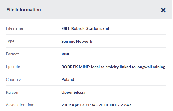
Figure 6.1. File information available in the results of data search application.
Overview
Content Tools